


Scaling a 20-year legacy into a digital powerhouse


INDUSTRY: UX UI, visual system
CLIENT: "Advanced Design Studio" course
YEAR: 2024

Overview
Sommelier is a digital platform that makes wine accessible to non-professionals by translating abstract tasting terms into clear visual scales. Users can compare wines quickly and confidently without technical knowledge. I designed the UX/UI, built the visual reference system, and defined the scales, wine profile structure, and core interface language.
About the exhibition
Where wine culture meets real people
For over two decades, the Sommelier Exhibition has been Israel's central hub for the wine industry. Yet wine communication remains inaccessible to non-professionals. Sommelier bridges this gap with a digital experience that translates technical tasting terminology into an intuitive visual reference system.


The challenge
How can a subjective product become comparable?
Wine language is full of abstract terms: aroma, mineral, complexity, dryness. These work within the industry but leave most people struggling to translate them into real taste and experience.
The goal was to create a translation layer that preserves wine's complexity while making it legible at a glance, without oversimplification.

_edited.jpg)
Research & Observations
Understanding where communication breaks down
I reviewed existing tasting systems and their visual representations, and spoke with winery owners, importers, and wine shop managers. A consistent pattern emerged: people are curious and willing to explore, but current descriptions are interpretive, which makes choice feel uncertain.
Insight
Industry
The industry still runs on physical events and personal connections, with limited digital continuity.
Create a digital layer that keeps the exhibition alive between events.
Design move
Perception
Tasting notes are interpreted through personal associations, making wines hard to compare.
Create a shared visual reference that supports confident comparison.
Design move
Language
Most tasting terms are abstract and non measurable without a consistent scale.
Translate descriptors into clear, comparable visual scales
Design move
Connections
Suppliers need continuity and relationships beyond one time exposure.
Build a dedicated space for collaboration, community, and follow up.
Design move
The Concept
A new way to experience wine digitally
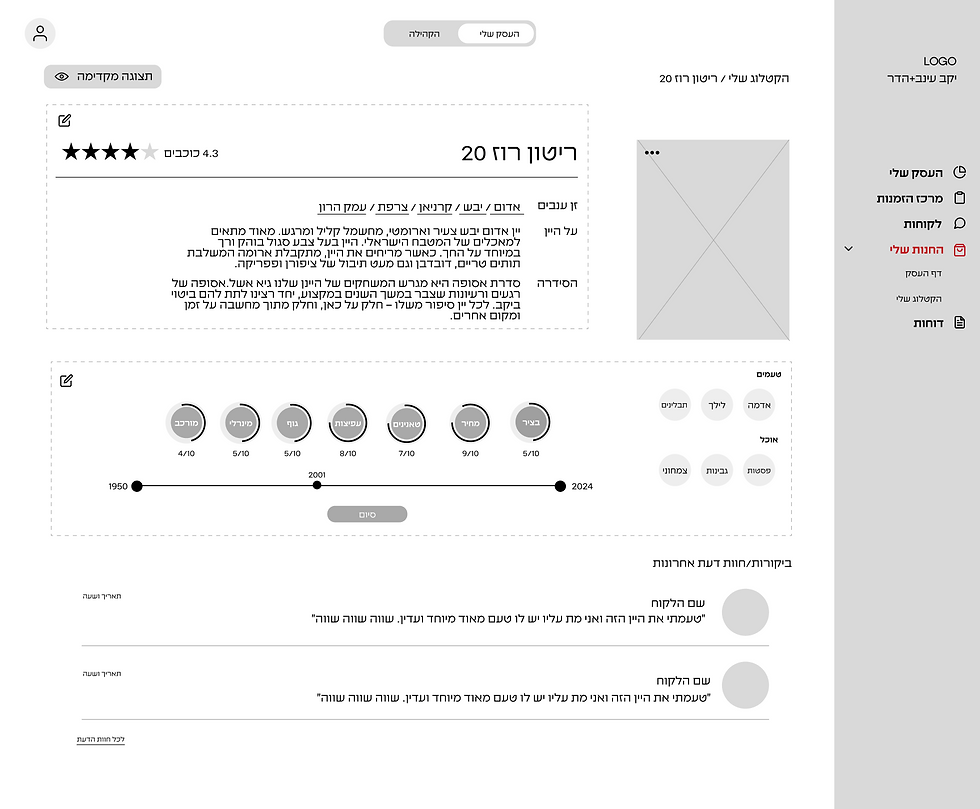
Sommelier proposes a system that reflects how wine is perceived, not only how it is described. Instead of reading abstract terms, users can see a wine’s profile through comparable visual scales, making choice and discovery more intuitive.

The Sensory System
Turning taste into something you can see
Key wine characteristics are translated into clear visual scales that allow fast comparison at a glance. Each wine profile becomes a visual snapshot of how the wine feels, supporting confident decision making without requiring technical knowledge.
Body
Complexity
Mineral
Astringency

Wireframe & Site Map
Low-Fidelity Exploration
Before designing the interface, I explored multiple wireframe directions to find the clearest way to present the wine meter, address suppliers' needs, and map the visitor journey. This low-fidelity exploration informed the final structure and layout.


Main Features
01 Wine Playground
Explore taste through interaction
An interactive space to explore how taste parameters shape a wine’s visual expression. Adjusting values such as body or astringency updates the system in real time.


02 The Dashboard
Understanding performance at a glance
A management interface for wine shop owners, providing a clear overview of sales, performance, and customer preferences - all in one place.

03 The Wine Community
Creating a shared space for a growing industry
A professional space for wineries, importers, and shop owners to connect, share knowledge, and discover collaboration opportunities through events, discussions, and learning materials.

Design System
Logo
Headline
30px light
Body Text1
Body Text2
15px light
Numbers
1234567890
//MICHROMA
Fonts
//EZER LOFT
Elements
Icons

Colors
20px light


LIGHT PEA GREEN
#C4FF79
C:23 M:0 Y:53 K:0
R: 196 G: 255 B: 121
BLACK
#000000
C:0 M:0 Y:0 K:0
R: 0 G: 0 B: 0
GRAY
#D9D9D9
C:0 M:0 Y:0 K:15
R: 217 G: 217 B: 217
WHITE
#FFFFFF
C:0.00 M:0.00 Y:0.00 K:0.00
R: 255 G: 255 B: 255
Minerality
Reflects mineral and earthy sensations often associated with soil, stone, and freshness, common in wines from cooler regions.
Body
Describes the physical weight and presence of the wine in the mouth, ranging from light and delicate to full and bold.
Complexity
Represents the richness and layered nature of the wine, expressing how many sensations unfold over time while tasting.
Astringency
Expresses the drying sensation caused by tannins, often found in red wines, influencing how sharp or soft the wine feels.
