Corporate merch for people who don’t want to look corporate
Brand identity, merch system, and digital design
Client: Off&Ice (B2B merch brand) // 2025

Overview
Off&Ice is a B2B employee merch brand concept built for people who care about design and lifestyle. The goal was to reframe corporate gifting from logo driven giveaways into curated objects employees would actually choose to keep, use, and bring home. I led the visual development across brand identity, packaging, and launch assets, creating a cohesive system that feels premium, modern, and personal.

The challenge
Translating abstract values into desirable objects
The employee merch category is often defined by predictable, logo centric solutions. The challenge was to translate workplace culture into desirable products and a brand system that feels human and intentional, while staying clean enough for a professional context.


The audience
Designing for the person, not the persona
The project speaks to two sides of the same coin: employees who crave a genuine connection to their workplace, and HR teams looking for a contemporary way to express culture. The focus was on creating something that feels like a personal choice, rather than a corporate requirement.
Process
From research to a system
I began by comparing corporate merch conventions with lifestyle and fashion branding to understand what creates desire beyond a logo. From there, I explored the tension between structure and personal expression, testing how a brand can feel both professional and premium. These learnings were distilled into a modular system applied across identity, packaging, and launch assets.
Research and comparison
Mapped the gap between corporate merch and lifestyle fashion.
Exploration
Tested the balance between structure and personal expression.
System
Translated insights into a modular identity and packaging language.


Key insight
Elevating merch into a human moment
The breakthrough happened when I reframed merch as a moment: specifically, the transition at the end of the workday when the professional "uniform" softens. This focus on the human experience became the foundation for the entire visual language.
Design System
Logo Variations
body text font- Inter
A
A
header font- Nord
A
A
header2 font- Chivo
A
A
Fonts
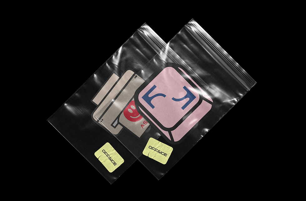
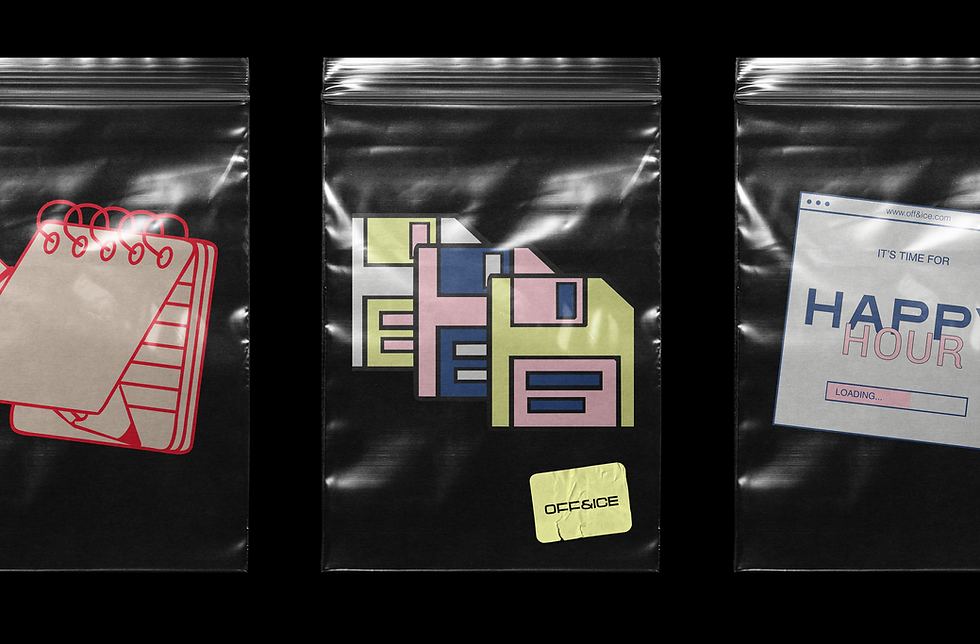
Graphic assets
Hands Off
asap


Product Visual Language


Packaging


Brand Launch Content
Looking back & ahead
Building value through restraint and detail
This project reinforced that people first branding is not about adding personality, but about designing value through coherence and detail. Next, I would explore personalization through generative tools, creating unique variations that still feel high end and tactile, without losing the brand’s calm, curated core.